
Ciao!みなさんこんにちは!このブログでは主に
(1)pythonデータ解析,
(2)DTM音楽作成,
(3)お料理,
(4)博士転職
の4つのトピックについて発信しています。
今回はpythonで綺麗な散布図を描く方法の第4回です!2次元の散布図上の点の密度をカラーで表示する「密度カラー散布図」の描画方法を具体的な実装例でご紹介します。今回は応用編として、密度カラー散布図と同時にx, y各軸の1次元ヒストグラムをプロットする方法を紹介します!
この記事を読めば、pythonで綺麗な2次元散布図をプロットする方法を知ることができます!ぜひ最後までご覧ください。
この記事はこんな人におすすめ
- Pythonでデータ解析をしている
- 散布図をかっこよく描きたい
Abstract | 散布図をヒストグラムと同時プロットして本格的に
データ点の分布を2次元で示す密度カラー散布図を1次元のヒストグラムと同時に描画することで、データ点の分布の様子がよりわかりやすくなり、見栄えも本格的になります。xとyの2変数のデータの分布を示す際、点の密度をカラーで示した2次元の散布図「密度カラー散布図」を用いることで、点が密集した場所の様子を表現することができます。
今回は「密度カラー散布図」に加え、xとyそれぞれの1次元のヒストグラムを同時にプロットして示す方法を解説します。2次元や1次元での密度計算を行う関数、点への割振りを行う関数、カラーバーを作る関数、描画する関数など、主要な機能ごとに関数としてまとめて実装しておくことで、密度カラー散布図を描きたい場面で簡単に描画することができます。今回の記事を見ながら、密度カラー散布図の実装をやってみてください!
Background | 綺麗な散布図「密度カラー散布図」とその描画方法
まずは密度カラー散布図についておさらいしておきましょう。この記事は密度カラー散布図シリーズの第4回です。これまでに、
- Matplotlib | Pythonで綺麗な2次元散布図を描く方法(1. 概要編)
- Matplotlib | Pythonで綺麗な2次元散布図を描く方法(2. 理論編)
- Matplotlib | Pythonで綺麗な2次元散布図の実装方法・コードの書き方(3. 基礎編)
という記事で、密度カラー散布図の有用性と基本的な考え方や実装方法ご紹介してきました。これらの内容をおさらいとして、密度カラー散布図の有用性と描画方法の8つの分類を復習しましょう。
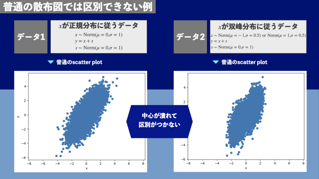
散布図は密度カラー散布図としてプロットすると見やすい
散布図を作成するとき、点と点が被って様子がわからなくなることがよくあります。点の密度をカラーで示す「密度カラー散布図」を使えば、点が密集していても分布の様子を表現することができます。
通常の散布図では点の密度が高い部分が潰れる
図1は正規分布に従うデータ点と双峰分布に従うデータ点を散布図にしたものです(詳細は過去記事「Matplotlib | Pythonで綺麗な2次元散布図を描く方法1(概要編)」参照)。図1の通常の散布図では中心部が潰れています。そのため、正規分布に従うデータと双峰分布に従うデータの区別ができません。
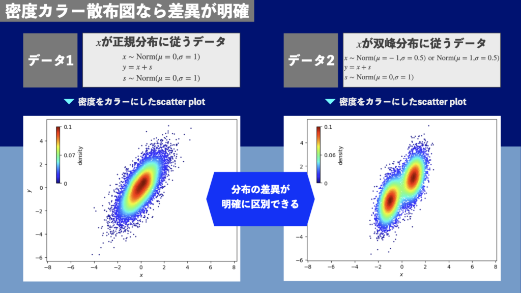
「密度カラー散布図」なら点の密度が高い部分も表現できる
一方、図2は密度カラー散布図です。点の密度をカラーで表現することで、データ点の密度が高い部分も表現できます。正規分布に従うデータ点と双峰分布に従うデータ点が明確に区別できます。データ点の密度が高い部分は情報量も多いため、このように的確に表現されるべきです。
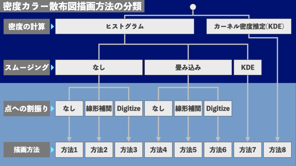
密度カラー散布図の8通りの描画方法
密度カラー散布図の描画方法は
- 密度の計算方法
- スムージングの方法
- 個々の点への密度の割当方法
によって8つに分類することができます(図3)。方法5や6が様々な場面で使いやすい描画方法です。方法1と4は散布図ではなく2次元ヒストグラムの見た目になります。方法7や8はカーネル密度推定(KDE)を使うため、データ点の数が多いと計算時間が長くなります。
今回は図3の8つの密度カラー散布図の描画方法を実装するコード例を紹介します。
各描画方法の特徴や理論、基本的な実装方法の詳細は過去記事参照
図3の8つの描画方法の詳しい特徴や
- カーネル密度推定(KDE)
- 線形補間
- Digitize
などの用語や理論的な背景については過去記事
で解説しています。こちらもぜひご覧ください!
密度カラー散布図を単独で描画する基本的な実装方法についても過去記事
で解説していますので、こちらもご覧ください!
Method | 密度カラー散布図を1次元ヒストグラムと同時描画する実装例
密度カラー散布図を1次元ヒストグラムと同時に描画する例をご紹介します。今回はx軸やy軸、密度を示すカラーの軸のスケールは線形のみとします。スケールを変更する例は次回以降で扱います。
ここからはJupyter Notebookで一緒に作業することを想定し、一つ一つご紹介していきます。実際にはここで用いた関数を通常のPythonソースコードにコピーして使ったり、Pythonのファイルにまとめてimportして使うことになるでしょう。ここでは簡単のためにJupyter Notebookで紹介します。
Resultの章にJupyter Notebookでの実装例を掲載するので、そちらを参照していただいても構いません。この章では、簡単な解説とともにソースコードを一つずつ提示します。解説が不要な方はResultの章に飛んでいただき、Jupyter Notebookでの実装例を参考にする方が早いかもしれません。
ライブラリのインポート
まずはライブラリをインポートしておきます。NumPy, Scipy, Matplotlibを使います。
import time
import numpy as np
import scipy as sp
from scipy import stats
from scipy import interpolate
import matplotlib.pyplot as plt
import matplotlib.gridspec as gridspec
import mpl_toolkits.axisartist as axisartist
関数の準備
密度の計算やスムージング、点への割振りを行う関数、作図する関数など必要な関数を定義しておきます。大部分は過去記事
で紹介したものです。こちらの過去記事で紹介したものと、今回初出のものをそれぞれ紹介していきます。
基礎編で既出の関数
過去記事
で紹介した関数については、今回は省略を解説し掲示するにとどめます。以下の関数を定義していきます。
- KDEで(x, y)での密度を計算する関数:
get_density_with_KDE() - ヒストグラムで密度を計算する関数:
get_density_from_hist() - ヒストグラムを線形補間する関数:
get_interpolator_from_hist() - ヒストグラムから任意の点の密度を返す関数を作る関数:
get_func_from_histogram2d() - 一連の密度計算をまとめる関数:
get_scatter_density() - カラーバーを内側に作成する関数:
draw_inset_colorbar_on_ax() - plotする関数:
plot_scatter_density()
KDEで(x, y)での密度を計算する関数
# get density at (x,y) using KDE with data points (x_i, y_i)
def get_density_with_KDE(
    x:np.ndarray,
    y:np.ndarray,
    bw_method="scott",
    wht_kde=None,
):
    """Get density at (x,y) using KDE with data points (x_i, y_i)
    Args:
        x (np.ndarray): x
        y (np.ndarray): y
        bw_method (str, optional): Bin width method passed to gaussian_kde. Defaults to "scott".
        wht_kde (np.ndarray): weights
    Returns:
        v (np.ndarray): density at (x, y)
        kernel (object): gaussian_kde kernel
    """
    # KDE
    kernel = sp.stats.gaussian_kde(
        [x, y],
        bw_method=bw_method,
        weights=wht_kde
    )

    # get density
    return kernel.pdf([x, y]), kernel
ヒストグラムで密度を計算する関数
# get density per bin using histogram
def get_density_from_hist(
    x:np.ndarray,
    y:np.ndarray,
    bins=["auto","auto"],
    density=True
):
    """Get density per bin using histogram
    Args:
        x (np.ndarray): x
        y (np.ndarray): y
        bins (list, optional): bins passed to histogram2d. Defaults to ["auto","auto"].
        density (bool, optional): If True, density is pdf (\int{\rho dx dy} = 1), otherwise number per bin
    Returns:
        h_vals (np.ndarray): histogram values
        x/y_bins (np.ndarray): histogram bins
        x/y_cens (np.ndarray): center of bins
    """
    # get bins for x and y
    x_bins = np.histogram_bin_edges(x, bins=bins[0])
    y_bins = np.histogram_bin_edges(y, bins=bins[1])
    x_cens = 0.5*(x_bins[:-1] + x_bins[1:])
    y_cens = 0.5*(y_bins[:-1] + y_bins[1:])

    # histogram 2d
    h_tmp, *_ = np.histogram2d(x, y, bins=[x_bins, y_bins], density=density)
    h_vals = h_tmp.T

    # end
    return h_vals, x_bins, y_bins, x_cens, y_cens
ヒストグラムを線形補間する関数
# get interpolator from hist
def get_interpolator_from_hist(
    x_cens:np.ndarray,
    y_cens:np.ndarray,
    v:np.ndarray,
    fill_value=0.0,
    bounds_error=False
):
    """Get interpolator
    Args:
        x_cens (np.ndarray): x bin center
        y_cens (np.ndarray): y bin center
        v (np.ndarray): histogram value
        fill_value (float, optional): fill_value passed to scipy.interploate. Defaults to 0.0.
        bounds_error (bool, optional): bounds_error passed to scipy.interpolate. Defaults to False.

    Returns:
        object: interpolation function (v = f_v([x, y]))
    """
    # get interpolator
    f_intrp = sp.interpolate.RegularGridInterpolator(
        (x_cens, y_cens), v,
        method="linear",
        fill_value=fill_value,
        bounds_error=bounds_error
    )

    # define a function
    def f_dense_from_hist(xy):
        """
            xy tuple of <1d array [N]>: x (xy[0]) and y (xy[1])
        """
        # - get x and y  - #
        x, y = xy[0], xy[1]
        # - get value - #
        return f_intrp((x,y))

    return f_dense_from_hist
ヒストグラムから任意の点の密度を返す関数を作る関数
# get function to privide value at (x, y) from 2d histogram - #
def get_func_from_histogram2d(
        x_edges:np.ndarray,
        y_edges:np.ndarray,
        h_vals:np.ndarray,
        v_outer=[0.0, 0.0, 0.0, 0.0]
    ):
    """
    description:
        get function to provide pdf from histogram
    arguments:
        x_edges <1d array [n_bin_r+1]>: bin edges for r
        y_edges <1d array [n_bin_rdot+1]>: bin edges for rdot
        h_vals <2d array [n_bin_rdot, n_bin_r]>: histogram (pdf)
        v_outer <list [4]>:
            x<x_l and y<y_l: v_outer[0],
            x<x_l and y>y_l: v_outer[1],
            x>x_l and y<y_l: v_outer[2],
            x>x_l and y>y_l: v_outer[3],
    returns:
        f_pdf <callable>: f_pdf(r,rdot) privides pdf
    """
    # - define a function - #
    def f_dense_from_hist(xy):
        """
            xy tuple of <1d array [N]>: x (xy[0]) and y (xy[1])
        """
        # - get x and y - #
        x, y = xy[0], xy[1]

        # - get index - #
        i_x = np.digitize(x, x_edges)-1
        i_y = np.digitize(y, y_edges)-1
        idx_xy = np.where(
            (0 <= i_x) & (i_x <= len(x_edges)-2) &
            (0 <= i_y) & (i_y <= len(y_edges)-2)
        )[0]
        idx_e1 = np.where((0 <= i_x) & (i_y > len(y_edges)-2))[0]
        idx_e2 = np.where((i_x > len(x_edges)-2) & (0 <= i_y))[0]
        idx_e3 = np.where((i_x > len(x_edges)-2) & (i_y > len(y_edges)-2))[0]

        # - get z - #
        z = x * 0.0 + v_outer[0]
        z[idx_xy] = h_vals[i_y[idx_xy], i_x[idx_xy]]
        z[idx_e1] = v_outer[1]
        z[idx_e2] = v_outer[2]
        z[idx_e3] = v_outer[3]

        # - return value - #
        return z

    # - end - #
    return f_dense_from_hist
一連の密度計算をまとめる関数
# get scatter density
def get_scatter_density(
    x:np.ndarray,
    y:np.ndarray,
    method_dense="hist",
    method_smooth="conv",
    method_points="interp",
    bw_kde="scott",
    bw_hist=["auto", "auto"],
    dns_hist=True,
    sig_smt=[2,2],
):
    """Get scatter density.
    Args:
        x (np.ndarray): x
        y (np.ndarray): y
        method_dense (str, optional): Method to calculate density. Defaults to "hist".
        method_smooth (str, optional): Method for smoothing. Defaults to "conv".
        method_points (str, optional): Method to get density at each point. Defaults to "interp".
        bw_kde (str, optional): Bin width parameter for Gaussian KDE. Defaults to "scott".
        bw_hist (list, optional): Bin width paramter for histogram. Defaults to ["auto", "auto"].
        dns_hist (bool, optional): Density parameter for histogram. Defaults to True.
        sig_smt (list, optional): Sigma [x, y] in smoothing. Defaults to [2,2].
    Returns:
        v (nd.array): density at (x,y)
        f_v (object): function for density at arbitrary position
        hist_vals (dict): "dense", "x_bins", "y_bins", "x_cens", "y_cens" from histogram
    """
    # get density using histogram at first
    h_vals, x_bins, y_bins, x_cens, y_cens = get_density_from_hist(
        x, y, bw_hist, density=dns_hist
    )

    # calculate density
    if method_dense == "kde":
        # method 8: KDE
        v, f_v = get_density_with_KDE(x, y, bw_kde)  # v = f_v([x,y])
    else:
        # smoothing
        if method_smooth == "kde":
            # method7: hist2d + kde
            x_ms, y_ms = np.meshgrid(x_cens, y_cens)
            _, f_v = get_density_with_KDE(x_ms.ravel(), y_ms.ravel(), bw_kde, h_vals.ravel()) # v = f_v([x,y])
            v = f_v([x, y])
        else:
            # apply smoothing
            if (sig_smt[0] > 0 or sig_smt[1] > 0) and method_smooth == "conv":
                h_vals = sp.ndimage.gaussian_filter(
                    h_vals, sig_smt, mode='nearest'
                )

            # map to points
            if method_points == "interp":
                # interpolate
                f_v = get_interpolator_from_hist(x_cens, y_cens, h_vals.T)
                v = f_v([x,y])
            elif method_points == "digitize":
                # digitize
                f_v = get_func_from_histogram2d(x_bins, y_bins, h_vals)
                v = f_v([x,y])
            else:
                # histogram
                v, f_v = None, None

    # histogram values into list
    hist_vals = {
        "dense": h_vals,
        "x_bins": x_bins,
        "y_bins": y_bins,
        "x_cens": x_cens,
        "y_cens": y_cens
    }

    # end
    return v, f_v, hist_vals
カラーバーを内側に作成する関数
# draw inset color bar
def draw_inset_colorbar_on_ax(
    ax:object,
    ax_sct:object,
    prm_clrbar={
        'show':True,
        'label':None,
        'pos':[0.2,0.10,0.6,0.02],
        'ori':'horizontal',
        'fmt':'%.3g',
        'n_ticks': 3,
        'fs':10
    }
):
    """Draw inset colorbar on ax
    Args:
        ax (object): Matplotlib axis object
        ax_sct (object): Matplotlib PathCollection object returned from plt.scatter
        prm_clrbar (dict, optional): Colorbar parameter. Defaults to { 'show':True, 'pos':[0.2,0.10,0.6,0.02], 'ori':'horizontal', 'fmt':'%.3g', 'n_ticks': 3, 'label':None, 'fs':10 }.
    Returns:
        cbar_ax (object): object returned from ax.inset_axes.
    """
    # inset colorbar
    if prm_clrbar['show']:
        # get inset colorbar axis
        cbar_ax = ax.inset_axes(prm_clrbar['pos'])
        cbs = plt.colorbar(
            ax_sct, cax=cbar_ax, orientation=prm_clrbar['ori'], format=prm_clrbar['fmt']
        )
        # ticks and ticklabels
        try:
            cbs.set_ticks(ax_sct.norm.inverse(np.linspace(0.0,1.0,prm_clrbar['n_ticks'])).data)
        except:
            print('** Warning, uninversible normalizer %s **' % (ax_sct.norm))
        # label
        cbs.set_label('%s' % (prm_clrbar['label']), size=prm_clrbar['fs'])
        cbs.minorticks_off()
        cbs.ax.tick_params(labelsize=prm_clrbar['fs'])
    else:
        cbar_ax = None

    # end
    return cbar_ax
1次元のヒストグラムを同時に表示するための関数
今回新たに登場する関数を用意します。1次元のヒストグラムを同時に表示するための関数たちです。以下の関数を定義しておきます。
- KDEで1次元の密度を作成する関数:
get_density1d_with_KDE() - ヒストグラムで1次元の密度を計算する関数:
get_density1d_from_hist() - 1次元の密度計算をまとめる関数:
get_density1d() - 全体をplotする関数:
plot_scatter_density_with_1d()
これらについては一つ一つ紹介すると同時に簡単な解説を付け加えます。
KDEで1次元の密度を作成する関数
KDEを使って1次元の密度を計算する関数を用意しておきます。方法8(図3)では2次元の密度をKDEで計算します。このとき1次元の密度もKDEで計算すると整合性を取ることができます。データ点のx座標またはy座標を示す1次元NumPy配列xを与えると、各x座標での密度とカーネルを返します。処理の流れは2次元の場合の関数get_density_with_KDEと同様です。
# get 1d density with KDE
def get_density1d_with_KDE(
    x:np.ndarray,
    bw_method="scott",
    wht_kde=None,
):
    """Get 1d density at x using KDE with data points x_i
    Args:
        x (np.ndarray): x
        bw_method (str, optional): Bin width method passed to gaussian_kde. Defaults to "scott".
        wht_kde (np.ndarray): weights
    Returns:
        v (np.ndarray): density at x
        kernel (object): gaussian_kde kernel
    """
    # KDE
    kernel = sp.stats.gaussian_kde(
        x,
        bw_method=bw_method,
        weights=wht_kde
    )

    # get density
    return kernel.pdf(x), kernel
ヒストグラムで1次元の密度を計算する関数
ヒストグラムを使って1次元の密度を計算する関数を用意しておきます。方法1から方法7(図3)では、2次元の密度がヒストグラムで計算されるので、1次元の密度もヒストグラムで計算するのが整合的です。引数はデータ点のx座標またはy座標を示す1次元NumPy配列xとビンの座標を示すNumPy配列binsです。2次元の密度をヒストグラムで計算する関数get_density_from_histの1次元版ですが、binは引数で与えることにしています。後ほど示しますが、2次元の密度計算の際にxとyのビンを得るので、binsにはその値を用いることを想定しています。
# get 1d histogram with convolution
def get_density1d_from_hist(
    x:np.ndarray,
    bins:np.ndarray,
    density=True
):
    """Get 1d histogram with convolution
    Args:
        x (np.ndarray): x data
        bins (np.ndarray): bins for x (passed to numpy.histogram)
        density (bool, optional): density passed to numpy.histogram. Defaults to True.
    Returns:
        np.ndarray: 1d histogram
    """
    # get 1d histogram
    h_vals, *_ = np.histogram(x, bins=bins, density=density)

    # end
    return h_vals
1次元の密度計算をまとめる関数
1次元の密度計算をまとめる関数を用意しておきます。2次元の場合の密度計算をまとめる関数get_scatter_densityの1次元版です。密度計算の方法、スムージングの方法に応じて手法を変えつつ1次元の密度を計算する関数です。
# get 1d density
def get_density1d(
    x:np.ndarray,
    x_bins:np.ndarray,
    x_cens:np.ndarray,
    method_dense="hist",
    method_smooth="conv",
    bw_kde="scott",
    dns_hist=True,
    sig_smt=2,
):
    # calculate density
    if method_dense == "kde":
        # method 8: KDE
        _, f_v = get_density1d_with_KDE(x, bw_method=bw_kde)  # v = f_v([x,y])
        h_vals = f_v(x_cens)
    else:
        # get density from hist
        h_vals = get_density1d_from_hist(
            x, x_bins, density=dns_hist
        )

        # smoothing
        if method_smooth == "kde":
            # method7: hist2d + kde
            _, f_v = get_density1d_with_KDE(x_cens, bw_method=bw_kde, wht_kde=h_vals) # v = f_v([x,y])
            h_vals = f_v(x_cens)
        else:
            # apply smoothing
            if sig_smt > 0 and method_smooth == "conv":
                h_vals = sp.ndimage.gaussian_filter(
                    h_vals, sig_smt, mode='nearest'
                )

    # end
    return h_vals
全体をplotする関数
密度カラー散布図を1次元のヒストグラムと同時にプロットする関数を用意します。データ点のNumPy配列x, yを第1, 第2引数として与え、密度計算の方法、スムージングの方法、点への割当方法をキーワード引数method_dense, method_smooth, method_pointsでそれぞれ指定します。
# get scatter-density plot with 1d density
def plot_scatter_density_with_1d(
    x:np.ndarray,
    y:np.ndarray,
    method_dense:str="hist",
    method_smooth:str="conv",
    method_points:str="interp",
    bw_kde="scott",
    bw_hist=["auto", "auto"],
    sig_smt=[2,2],
    label_xy=["x", "y"],
    cmap=plt.cm.Greens,
    prm_fig={'figsize':[6*1.25,6*1.25], 'w_ratios':(4,1), 'h_ratios':(1,4)},
    prm_hist1d={'label':'density', 'color':'grey', 'fill':True, 'mrk':'+', 'ms':2},
    prm_clrbar={'show':True, 'label':'density', 'pos':[0.05,0.65,0.02,0.30], 'ori':'vertical', 'fmt':'%.2g', 'n_ticks': 3, 'fs':8}
):
    """Get scatter-density plot with 1d histogram
    Args:
        x (np.ndarray): x
        y (np.ndarray): y
        method_dense (str, optional): Method to calculate density. Defaults to "hist".
        method_smooth (str, optional): Method for smoothing. Defaults to "conv".
        method_points (str, optional): Method to get density at each point. Defaults to "interp".
        bw_kde (str, optional): Bin width parameter for Gaussian KDE. Defaults to "scott".
        bw_hist (list, optional): Bin width paramter for histogram. Defaults to ["auto", "auto"].
        sig_smt (list, optional): Sigma [x, y] in smoothing. Defaults to [2,2].
        label_xy (list, optional): Label for x and y axis. Defaults to ["x", "y"].
        cmap (object, optional): Colar map parameter in matplotlib. Defaults to plt.cm.Greens.
        prm_fig (dict, optional): Figure parameters. Defaults to {'figsize':[6*1.25,6*1.25], 'w_ratios':(4,1), 'h_ratios':(1,4)}.
        prm_hist1d (dict, optional): Parameters for 1d histogram. Defaults to {'label':'density', 'color':'grey', 'fill':True, 'mrk':'+', 'ms':2}.
        prm_clrbar (dict, optional): Parameters for colar bar. Defaults to {'show':True, 'label':'density', 'pos':[0.05,0.65,0.02,0.30], 'ori':'vertical', 'fmt':'%.2g', 'n_ticks': 3, 'fs':8}.

    Returns:
        v (nd.array): density at (x,y)
        f_v (object): function for density at arbitrary position
        hist_vals (dict): "dense", "x_bins", "y_bins", "x_cens", "y_cens" from histogram
        hist1d_vals (dict): "x", "y" for 1d histogram for x and y
    """
    # time measurement
    t_0 = time.time()

    # get scatter density
    v, f_v, hist_vals = get_scatter_density(
        x, y,
        method_dense=method_dense,
        method_smooth=method_smooth,
        method_points=method_points,
        bw_kde=bw_kde,
        bw_hist=bw_hist,
        sig_smt=sig_smt
    )

    # get 1d histogram for x/y
    hist1d_vals = {}
    hist1d_vals["x"] = get_density1d(
        x, hist_vals["x_bins"], hist_vals["x_cens"],
        method_dense=method_dense,
        method_smooth=method_smooth,
        bw_kde=f_v.factor if method_dense == "kde" or method_smooth == "kde" else None,
        sig_smt=sig_smt[0]
    )
    hist1d_vals["y"] = get_density1d(
        y, hist_vals["y_bins"], hist_vals["y_cens"],
        method_dense=method_dense,
        method_smooth=method_smooth,
        bw_kde=f_v.factor if method_dense == "kde" or method_smooth == "kde" else None,
        sig_smt=sig_smt[1]
    )

    # set figure
    fig = plt.figure(figsize=prm_fig['figsize'])
    gs = fig.add_gridspec(
        2, 2,
        wspace=0.0, hspace=0.0,
        width_ratios=prm_fig['w_ratios'], height_ratios=prm_fig['h_ratios']
    )
    axs = {0:{},1:{}}

    # plot 1d x hist
    i1, i2 = 0, 0
    axs[i1][i2] = plt.subplot(gs[i1,i2], axes_class=axisartist.Axes)
    axs[i1][i2].axis['left'].major_ticklabels.set_va('bottom')
    axs[i1][i2].axis['bottom'].major_ticklabels.set_visible(False)
    axs[i1][i2].set_ylabel(prm_hist1d['label'])
    axs[i1][i2].stairs(
        hist1d_vals["x"], edges=hist_vals["x_bins"],
        color=prm_hist1d['color'], fill=prm_hist1d['fill']
    )

    # plot 1d y hist
    i1, i2 = 1, 1
    axs[i1][i2] = plt.subplot(gs[i1,i2],axes_class=axisartist.Axes)
    axs[i1][i2].axis['bottom'].major_ticklabels.set_ha('left')
    axs[i1][i2].axis['left'].major_ticklabels.set_visible(False)
    axs[i1][i2].set_xlabel(prm_hist1d['label'])
    axs[i1][i2].stairs(
        hist1d_vals["y"], edges=hist_vals["y_bins"],
        color=prm_hist1d['color'], fill=prm_hist1d['fill'], orientation='horizontal'
    )

    # plot scatter density
    i1, i2 = 1, 0
    axs[i1][i2] = plt.subplot(gs[i1,i2])
    axs[i1][i2].set_xlabel(label_xy[0])
    axs[i1][i2].set_ylabel(label_xy[1])
    if v is None:
        ax_clr = axs[i1][i2].pcolormesh(
            hist_vals["x_bins"], hist_vals["y_bins"], hist_vals["dense"],
            cmap=cmap
        )
    else:
        ax_clr = axs[i1][i2].scatter(
            x, y, c=v,
            cmap=cmap, s=10, lw=0.0, edgecolor='silver'
        )

    # inset colorbar
    ax_cbar = draw_inset_colorbar_on_ax(axs[i1][i2], ax_clr, prm_clrbar=prm_clrbar)

    # time measurement
    t_1 = time.time()
    print(' Elapsed Time: %.3g sec' % (t_1 - t_0))

    # end
    return v, f_v, hist_vals, hist1d_vals
キーワード引数
キーワード引数は
- method_dense: 密度の計算方法(
"hist"または"kde") - method_smooth: スムージングの方法(
"none","conv", または"kde") - method_points: 点への割当方法(
"none","interp"または"digitize") bw_kde: KDEで密度計算する際に、scipy.stats.gaussian_kdeのbw_methodに渡すパラメータbw_hist: ヒストグラムで密度計算する際に、numpy.histogram_bin_edgesのbinsに渡すパラメータsig_smt: 畳み込みでスムージングする際のGaussianの幅(scipy.ndimage.gaussian_filterのsigma)label_xy: x軸とy軸のラベルcmap: 密度を表すカラーのカラーマップprm_fig: 図のサイズや縦横比などのパラメータprm_hist1d: 1次元のヒストグラムの線種や色などの描画パラメータprm_clrbar: カラーバーのラベルや位置などのパラメータ
となります。
関数内での処理の流れ
関数plot_scatter_density_with_1dではまず、2次元の点の密度の計算が関数get_scatter_densityを使って行われます。関数get_scatter_densityで計算されたx方向, y方向のビン、KDEのカーネル幅などを用い、関数get_density1dで1次元の密度が計算されます。
ひとたび2次元での密度と1次元での密度が計算されれば、あとはplotしていくだけです。左上(gs[0,0])と右下(gs[1,1])にxとyの1次元ヒストグラムを、左下(gs[1,0])に密度カラー散布図をプロットします。
Result | 用意した関数を用いてplotする例
上記で作成した関数を用いて、1次元ヒストグラム付きの密度カラー散布図を描画してみましょう。
データ点の準備
まずはplotの例示に用いるデータ点を準備します。過去記事
- Matplotlib | Pythonで綺麗な2次元散布図を描く方法(1. 概要編)
- Matplotlib | Pythonで綺麗な2次元散布図を描く方法(2. 理論編)
- Matplotlib | Pythonで綺麗な2次元散布図の実装方法(3. 基礎編)
でも登場した、普通の散布図では区別がつかない例を取り上げます。下記のように、双方分布に従う点を1万個用意しておきます。
# prepare data points 2
x2 = np.r_[
    np.random.normal(loc=-1.0, scale=0.5, size=5000),
    np.random.normal(loc=1.0, scale=0.5, size=5000)
]
y2 = x2 + np.random.normal(size=len(x2))
それぞれの方法でplotを作成
方法1から方法8(図3)までの方法で密度カラー散布図を描いていきます。method_dense, method_smooth, method_pointsの引数でどの方法を選択するか指定し、plot_scatter_density_with_1dで描画します。
方法1: 2次元ヒストグラム
方法1は「密度計算: ヒストグラム、スムージング: なし、点への割振り: なし」なので、ただの2次元ヒストグラムとなります。引数にmethod_dense="hist", method_smooth="none", method_points="none"を指定してplot_scatter_density_with_1dを実行します。
_ = plot_scatter_density_with_1d(
    x2,
    y2,
    method_dense="hist",
    method_smooth="none",
    method_points="none",
    cmap=plt.cm.Greens
)
実行時間は私の環境では0.0772秒となりました。
方法2: 密度カラー散布図(ヒストグラム・スムージングなし・線形補間)
方法2では「密度計算: ヒストグラム、スムージング: なし、点への割振り: 線形補間」で密度カラー散布図を描きます。引数にmethod_dense="hist", method_smooth="none", method_points="interp"を指定してplot_scatter_density_with_1dを実行します。ちなみに密度カラー散布図の場合、cmapはjetが見やすいです。
_ = plot_scatter_density_with_1d(
    x2,
    y2,
    method_dense="hist",
    method_smooth="none",
    method_points="interp",
    cmap=plt.cm.jet
)
実行時間は私の環境では0.0363秒となりました。
方法3: 密度カラー散布図(ヒストグラム・スムージングなし・Digitize)
方法3では「密度計算: ヒストグラム、スムージング: なし、点への割振り: Digitize」として、密度カラー散布図を描きます。引数にmethod_dense="hist", method_smooth="none", method_points="digitize"を指定してplot_scatter_density_with_1dを実行します。
_ = plot_scatter_density_with_1d(
    x2,
    y2,
    method_dense="hist",
    method_smooth="none",
    method_points="digitize",
    cmap=plt.cm.jet
)
実行時間は私の環境では0.0359秒となりました。
方法4: 2次元ヒストグラム(スムージングあり)
方法4では「密度計算: ヒストグラム、スムージング: 畳み込み、点への割振り: なし」として、スムージングされた2次元ヒストグラムを描きます。引数にmethod_dense="hist", method_smooth="conv", method_points="none"を指定してplot_scatter_density_with_1dを実行します。
_ = plot_scatter_density_with_1d(
    x2,
    y2,
    method_dense="hist",
    method_smooth="conv",
    method_points="none",
    cmap=plt.cm.Greens
)
実行時間は私の環境では0.0324秒となりました。
方法5: 密度カラー散布図(ヒストグラム・畳み込みスムージング・線形補間)
方法5では「密度計算: ヒストグラム、スムージング: 畳み込み、点への割振り: 線形補間」として、密度カラー散布図を描きます。引数にmethod_dense="hist", method_smooth="conv", method_points="interp"を指定してplot_scatter_density_with_1dを実行します。短い計算時間で綺麗な密度カラー散布図を作ることができるおすすめの設定です。
_ = plot_scatter_density_with_1d(
    x2,
    y2,
    method_dense="hist",
    method_smooth="conv",
    method_points="interp",
    cmap=plt.cm.jet
)
実行時間は私の環境では0.0338秒となりました。
方法6: 密度カラー散布図(ヒストグラム・畳み込みスムージング・Digitize)
方法6では「密度計算: ヒストグラム、スムージング: 畳み込み、点への割振り: 線形補間」として、密度カラー散布図を描きます。引数にmethod_dense="hist", method_smooth="conv", method_points="digitize"を指定してplot_scatter_density_with_1dを実行します。
_ = plot_scatter_density_with_1d(
    x2,
    y2,
    method_dense="hist",
    method_smooth="conv",
    method_points="digitize",
    cmap=plt.cm.jet
)
実行時間は私の環境では0.0362秒となりました。
方法7: 密度カラー散布図(ヒストグラム・KDE)
方法7では「密度計算: ヒストグラム、スムージング: KDE」として、密度カラー散布図を描きます。点への割振りはKDEで行われるので指定する必要はありません。引数にmethod_dense="hist", method_smooth="kde"を指定してplot_scatter_density_with_1dを実行します(method_pointsは任意の値で構いません)。
_ = plot_scatter_density_with_1d(
    x2,
    y2,
    method_dense="hist",
    method_smooth="kde",
    method_points="none",
    cmap=plt.cm.jet
)
実行時間は私の環境では0.126秒となりました。方法1から6までよりも4倍程度長いです。
方法8: 密度カラー散布図(KDE)
方法8では「密度計算: KDE」として、密度カラー散布図を描きます。引数にmethod_dense="kde"を指定してplot_scatter_density_with_1dを実行します(method_smoothやmethod_pointsは任意の値で構いません)。すべてKDEで計算するので、計算時間が長くなる欠点があることに注意してください。
_ = plot_scatter_density_with_1d(
    x2,
    y2,
    method_dense="kde",
    method_smooth="none",
    method_points="none",
    cmap=plt.cm.jet
)
実行時間は私の環境では1.32秒となりました。方法1から6までよりも40倍ほど時間がかかります。
それぞれの方法での描画結果
図4から図6にそれぞれの方法による描画結果を示します。密度カラー散布図を1次元のヒストグラムと同時に見ることができるので、データ点の分布の様子がよりわかりやすいです。


実装コード例(Jupyter Notebook)
今回のPythonコードの実装例を掲載します。こちらをご覧になったほうが、全体の流れはわかりやすいでしょう。
Conclusion | まとめ
最後までご覧頂きありがとうございます!
Pythonで密度カラー散布図を1次元のヒストグラムの同時描画する実装方法をご紹介しました!
データ点の分布を2次元で示す密度カラー散布図を1次元のヒストグラムと同時に描画することで、データ点の分布の様子がよりわかりやすくなります。本格的なグラフになり見栄えもよくなるのでおすすめです。関数としてまとめておくことで、このような高度なグラフも簡単に描くことができます。
密度カラー散布図の描画には密度計算、スムージング、点への割振りといった工程が必要で、実装には少し手間がかかりますが、一度関数として定義したソースコードを持っておけば、importしたりコピー&ペーストしてすぐに使うことができます!ぜひ一度、実装してみてください!
以上「Matplotlib | Pythonで散布図を1次元ヒストグラムと同時にプロットする方法(4. 応用編)」でした!
またお会いしましょう!Ciao!
References | 本シリーズの関連記事
本シリーズ「Pythonで綺麗な2次元散布図を描く方法」の関連記事は以下です。 第1回の概要編に加え、密度カラー散布図の描き方の分類(2. 理論編)、基本的な実装方法(3. 基礎編)、1次元のヒストグラムと同時に描画する方法(4. 応用編)、軸のスケール設定を組み合わせる実装方法(5. 発展編)、任意の軸スケールで1次元ヒストグラムと同時に描画する方法(6.特別編)など詳しく扱っておりますので参考にどうぞ!
- Matplotlib | Pythonで綺麗な2次元散布図を描く方法(1. 概要編)
- Matplotlib | Pythonで綺麗な2次元散布図を描く方法(2. 理論編)
- Matplotlib | Pythonで綺麗な2次元散布図の実装方法(3. 基礎編)
- Matplotlib | Pythonで散布図を1次元ヒストグラムと同時にプロットする方法(4. 応用編)
- Matplotlib | 任意の軸スケールで密度カラー散布図をプロットする方法(Python散布図 5. 発展編)
- Matplotlib | 密度カラー散布図を任意の軸スケールで1次元ヒストグラムと同時にプロットする方法(Python散布図 6. 特別編)
コメント